Four brand colours mean charts can carry five categorical series natively.
Each colour holds its role across decks — teal=primary, magenta=hero, cobalt=secondary, saffron=tertiary.
Visual reference for the Zonk brand — voice, palette, typography, logo treatments, graphics, components, rules. The markdown guides linked below are the source of truth; this page is the visual companion.
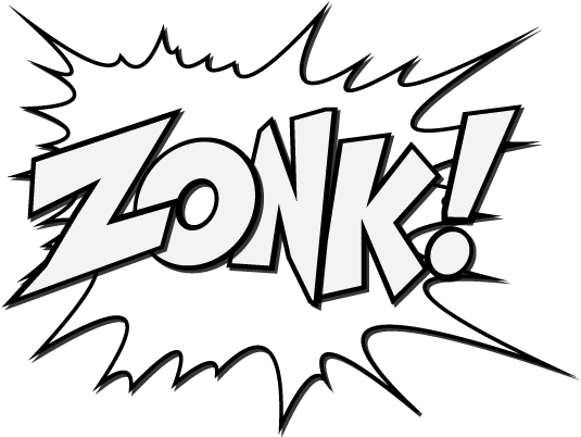
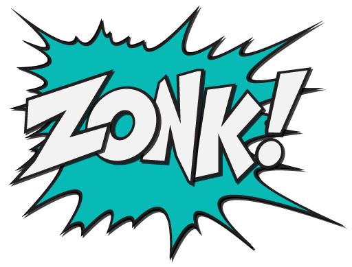
Four logo assets, each with a defined role. Burst is the hero mark (title slides, covers). Outline is the everyday mark (content-slide footers, document headers). Wordmark is for compact spaces and as the interchange option when burst dominates the composition.
| Context | Default | Substitute | Notes |
|---|---|---|---|
| Title / cover slide | Burst | Wordmark | ~480–640px high. Substitute wordmark when burst dominates the composition. |
| Content slide footer | Outline | — | ~120px wide, low-key, top-right or bottom-right. Flip strokes to ink on cream paper. |
| Dark-mode hero panel | Outline | Wordmark | White-stroke version on midnight or slate. Burst interior closes up at small sizes on dark. |
| Coloured background | Burst | Wordmark | Either works on teal / magenta / cobalt. Pick by composition. |
| Email sig, favicon, social | Wordmark | — | Compact, no burst silhouette needed at small scale. |
Never reproduce a mark below its minimum height — under this the comic detail closes up and the silhouette stops reading.
| Mark | Minimum height | Why |
|---|---|---|
| Burst | 75px | The most detailed mark — the interior ZONK! and the explosion spikes muddy first, so it needs the most height. |
| Wordmark | 55px | Compact contexts, signatures, social. Counters and the exclamation fill in below this. |
| Outline | 35px | The lightest mark — strokes hold at the smallest size, e.g. content-slide footers. |
Keep a clear margin around every mark so nothing crowds it. The unit is the dot of the exclamation mark in ZONK! — leave 2× that dot on all four sides. Because the unit is taken from the mark itself, the clear space scales automatically with the logo at any size.
Substitute for the burst when the burst dominates the composition or scale is too small for the silhouette to read.
The outline source PNG is white-stroke (designed for dark backgrounds). On cream or any light surface, flip the strokes to ink.
Warm cream paper with deep midnight-navy section panels. Four saturated brand accents (teal, magenta, cobalt, saffron). Never more than two accents per composition. Total accents cap at ~15% of any layout.
Tailwind-style ramps for each brand colour. Canonical brand value marked with ●. Midnight and Paper extend two steps lighter than the standard ramp (10 and 25) for pale-tint surfaces.
Two fonts. Outfit for 95% of typography (display, headings, body, UI), Bagel Fat One for cut-through moments (hero stats, narrator callouts, single-word headline emphasis). Headlines always UPPERCASE. Weight column shows the Slides/Docs label first — the CSS weight is in brackets.
Black for headlines · Thin for sub-headers · Bold for in-copy emphasis · ExtraLight for body · Regular only as a fallback under 14px. Larger elements (sub-heads) get lighter weight; smaller elements get just enough stroke contrast to stay legible.
Single weight. Always upright. Always UPPERCASE. Never below 24px. Used sparingly — hero stats, chapter numerals, narrator callouts, and the single-word headline emphasis trick. Never apply additional bold styling — there's only one weight, and CSS font-weight is ignored.
Used for code, design tokens, hex values, file paths, and anywhere we want a typewriter feel. Three weights load (400, 500, 600). 500 is the workhorse — inline code refs, ramp labels, dev specs. Never UPPERCASE, never letter-spaced. Stack: font-family: 'JetBrains Mono', 'SF Mono', Menlo, Consolas, monospace;
background: var(--paper-50); on the body element.Outfit must always be loaded via Google Fonts in any artefact under our control. The fallback stack — font-family: 'Outfit', 'Avenir Next', 'Inter', 'Helvetica Neue', Helvetica, sans-serif; — is a last resort. It kicks in when web fonts can't load (offline, locked-down email clients, restricted Confluence/Notion exports). If you find the fallback rendering in real work, fix the font loading first; don't redesign around it.
Order rationale: Avenir Next ships on macOS/iOS and is geometrically the closest match to Outfit. Inter is widely installed on creative and developer machines, renders cleanly at every size. Helvetica Neue and Helvetica are the universal floor — every device will land there at worst.
Three categories of graphical element — pills (layout component for subtitles and content rows), illustrations (comic-book line art), and shapes (decorative coloured blocks). All share the same comic-as-punctuation discipline.
A pill always bleeds one edge (left or right). Width can match the copy (snug) or match a layout column. In a row of pills, only one bleeds — the others sit fully rounded.
border-radius: 999px.paper-50 on midnight or slate. Darker pill tint (e.g. midnight-700) when the pill should recede.ink-700 (or paper-50 on dark tint). Single line ideally, two if needed. Never for body paragraphs.Left bleed: border-radius: 0 999px 999px 0; margin-left: -[parent-padding]; padding-left: [parent-padding];
Right bleed: border-radius: 999px 0 0 999px; margin-right: -[parent-padding];
Column-width: add margin-right: 50px (or margin-left: 50px for right-bleed) for the clear-space rule.
Comic-book line art used exactly as supplied — never inverted, never colour-shifted. The artwork is black-line on transparent; place it on a light background (paper, paper-100, white). If a dark-mode variant is ever needed, that version will be supplied separately. Full style brief and AI prompt seeds in illustration.md.
A couple of looping animations exist — short, simple, minimal. Use them sparingly on web hero blocks, transitions between sections, or as visual breathers in long-form content. Animation is a moment, not a feature; one loop per page.
Animation rules: loop subtly, no fast jump cuts, no flashing; never autoplay anything with sound; place the loop on the background it was designed for (Logo on midnight, Hero on black, Trolley on white); don't overlay text on top of an active loop.
The burst silhouette in logo/graphics/ doubles as a watermark on content pages — bottom-right, used as supplied, with the page number sitting centred inside it. The burst as graphic element, not the brand logo. Subtle by design.
A short content slide. The grey burst silhouette sits modestly in the bottom-right corner as a watermark — pale enough not to compete with the headline or body, but clearly there. The page number lives inside it in Bagel Fat One.
 07
07
The watermark is shown enlarged (240px) and inked-up so the very fine grey strokes are visible against cream in the lookbook. Live-use sits at ~140px and uses the asset unmodified — the real watermark is much quieter on the page than what you see here.
logo/graphics/zonk_burst_grey_*.png — pale grey strokes on transparent. Two sizes ship; pick whichever crop fits the corner.Solid coloured squares — single, paired, or in small clusters — used as accent marks. Three sizes, three placements, one gap ratio. Shapes sit next to content, never around it (for framing, use the burst outline).
Small (16px) for inline ornaments inside paragraphs. Medium (40px) as a headline accent. Large (80–120px) as section breaks or chapter-opener anchors. Don't pick sizes in between — the three steps are deliberate.
Gap = one-third of the square width. 16px → ~6px gap · 40px → ~14px · 80px → ~27px · 120px → ~40px. Tighter than ⅓ looks crowded; looser looks unmoored.
No more than two accents in one stack. Ink or paper-200 may anchor either combo. Magenta+teal is the classic pair; cobalt+saffron is the secondary one. Mixing all four reads as noise.
Three valid spots: above a headline as a colour bar, between paragraphs as a breather, or in a card corner as an ornament. Shapes never enclose content — for framing, use the burst outline.
paper-200. Magenta+teal or cobalt+saffron are the canonical pairs. Never all four accents together.Above a headline as a colour bar (3–4 squares at 40px).
Between paragraphs as a small breather (3–5 squares at 14–16px).
In a card corner as an ornament (single square or pair at 40–80px).
The brand applied in situ. Tabs walk through slide layouts, UI components, hero stats, callouts, charts, and chapter openers. Click a tab — the panel below changes.
Four brand colours mean charts can carry five categorical series natively.
Each colour holds its role across decks — teal=primary, magenta=hero, cobalt=secondary, saffron=tertiary.
A link to the training session will be shared later today.
One-pager summarising the key points covered in today's session.
Drop me an email if you have any questions.
Hover · each button darkens to the 700 step of its accent ramp. Ghost buttons hover to paper-100 background.
Meanwhile, the stack quietly started doing the thing it was supposed to do six months ago.
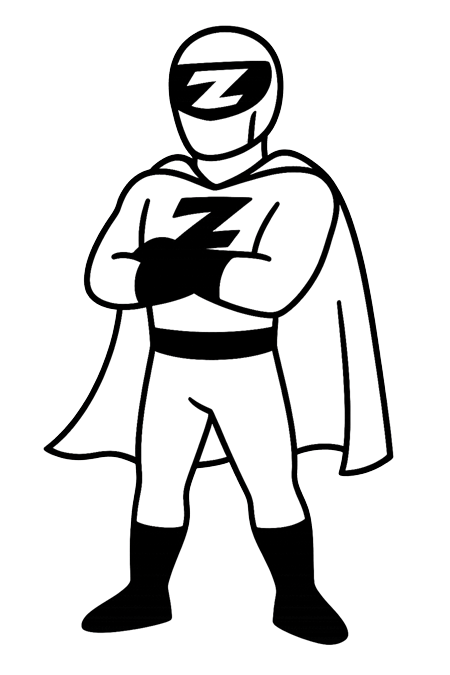
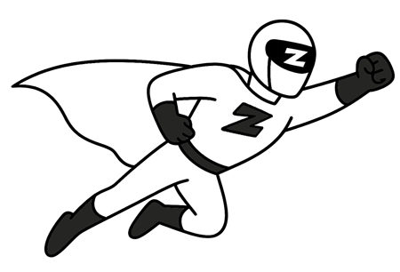
Comic-book narrator box paired with the Zonk hero illustration. Illustration sits on a light surface (paper-100) — never inverted, never on a dark bg.
The dashboards stopped lying. The funnels stopped leaking. The pipeline kept its promise.
Dark variant for chapter dividers and section opens on a midnight section panel. Shadow swaps to magenta — comic-book offset is the same, the colour signals high-emphasis.
Six months in, the legacy CRM showed up again — schema drift, missing fields, the lot.
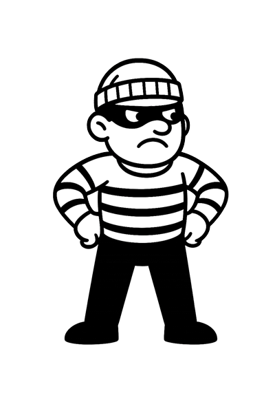
Use the villain for the section that names the problem. The hero arrives in the section after — a narrative pair, not a single image.
Six months of automation logic, cleaner data feeds, and a lifecycle email rebuild — the messy middle of a project that ended in a clean dashboard.
A short, honest list of what didn't survive the rebuild — and the handful of things that did, and why those are the ones we kept.
The next two quarters of investment, the metrics we're watching, and the bit where we say what we'd do differently if we started over.
One accent shift (Q4 → magenta) marks the punchline. The rest stays in teal.
Five-series chart uses the full categorical palette — the data viz carve-out from the 2-accent cap.
Solid pie for proportions; donut is the default but pie reads fine for ≤4 series at large size.
Two-series line uses primary + hero. The hero accent (magenta) marks the metric that mattered.
The dashboard finally told us the truth — and then the next quarter started telling us what to do next.
Six months in we still had two CRMs, three reporting tools and no idea which numbers were right. By the end we had one of each — and the right ones.
They quietly fixed the stack while we kept selling. That's the bit that mattered.
Pull quotes use Outfit ExtraLight at large size for editorial weight. The opening glyph is Bagel Fat One — the only pop of comic in the block. Pick the variant that matches the surrounding page: paper for an editorial moment, dark for section-divider weight, short for a one-line punch.
| Mode | Canvas | Surface | Text | Accents | Notes |
|---|---|---|---|---|---|
| Light · Regular | paper-50 · #F8F3E7 | white · #FFFFFF paper-100 · #F0E9D4 |
ink-900 · #14110F ink-500 · #5A5650 |
magenta-500 · #BC2D6E teal-500 · #0E7B7B |
The default — decks, SOWs, case studies. Two accents max. |
| Light · White | white · #FFFFFF | paper-25 · #FCFAF3 midnight-50 · #ECEDF1 (lines) |
ink-900 · #14110F ink-500 · #5A5650 |
magenta-500 · #BC2D6E | Cream dialled out for co-branded work, print, screenshots. One accent; eyebrows go to ink. The sanctioned exception to "white is components only". |
| Dark · Regular | midnight-900 · #131A2C | midnight-800 · #1F263B slate-500 · #3D4663 |
paper-50 · #F8F3E7 midnight-100 · #D2D5DE |
teal-bright · #1AA59E magenta-300 · #E76F9F |
Hero panels, dividers, title / closing slides. Step accents lighter so they read on navy. |
| Dark · Plain | midnight-900 · #131A2C | midnight-800 · #1F263B midnight-700 · #2C3450 (lines) |
paper-50 · #F8F3E7 midnight-300 · #7A8395 |
teal-bright · #1AA59E | Long-form dark decks and data-dense slides. One restrained accent; punch word goes monochrome. |
The rules that matter — the ones people get wrong most often. Anything not here lives in fonts.md, palette.md, or brand.md.
H1–H3, slide titles, buttons, tags, eyebrows. Body, leads and captions stay sentence case.
Sub-heads are deliberately lighter than body. Thin at 22px+ reads elegant; ExtraLight at 16px+ stays legible.
Left OR right — never both, never neither. Width matches copy (snug) or column (with ~50px clear space).
Wordmark substitutes for either when restraint is needed. Apply filter: invert(1) to the outline mark on cream.
Hero stats, chapter numerals, narrator callouts, single-word headline emphasis. One Bagel moment per composition.
Teal + magenta, or cobalt + saffron. Each colour ≤5% of any layout. Total accents ≤15%.
teal-500 → teal-700, magenta-500 → magenta-700, etc. Ghost buttons hover to paper-100.
Solid coloured squares in complementary brand colours, under headlines or between paragraphs. Sparse and deliberate.
"Doubled conversion for 4WD Supacentre" beats "unlocked transformational growth". Australian by default.
Display only, 24px and above. For body emphasis use Outfit Bold (in accent colour if needed).
Only one weight exists. Don't write font-weight: 700 on it — CSS ignores it and it reads as a mistake.
The bleed exists for alignment with surrounding copy. Island pills break the column grid.
Column-width pills always keep ~50px clear space between the pill end and the opposite page bleed.
Both go spindly. Bump to Regular (400) for small text, Bold (700) for micro labels.
Fails WCAG AA contrast. Saffron is fills/accents only. Use teal-500 for any text-bearing teal.
Accents are moments, not walls. Maximum one solid accent block per slide (button, callout, tagged word).
Magenta = brand, red = error. Used together they become semantically confused. Pick one.
leverage, synergy, best-in-class, holistic, transformational, unlock potential, mission-critical, at scale, seamless — all out.